If you’ve followed along on my journey to making our new #BullardAbode home, then you know it has been quite the venture. Ha! I absolutely love putting together our home, and decorating is my jam! I’m a TJ Maxx and Homegoods frequenter and find so much enjoyment making our space feel cozy and “us.” Our new house feels like such blessing that just fell into our laps, and we are SO grateful!! But of course the style is not exaaaactly what I would choose for myself. Especially…. the mantel. Let’s start there because honestly the pain point is what started this whole conversation over on Instagram. And let me tell y’all, you were INVESTED in the the mantel drama!! So this post is for you!
The mantel has been nothing but a struggle for me to decorate. Mostly because that darn cut out in the wall feels so inconvenient. Originally I was hoping to find something large (a canvas, art piece, mirror, etc) to cover the entire opening as if it weren’t even there, but that idea quickly went out the window when I learned that every.thing. I like was not the right dimensions. It was either wide enough but not tall enough, or vice versa. So I resorted to working with the opening instead of against. Thankfully, I had a lot of decor already that I was able to shop through at home, and after some a lot of trial and error, and a few purchased pieces later, I finally settled on something I think I like. At least for now.
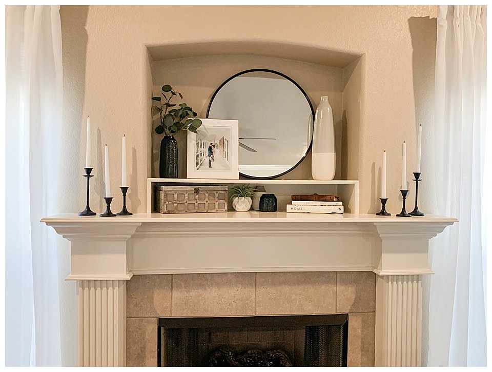
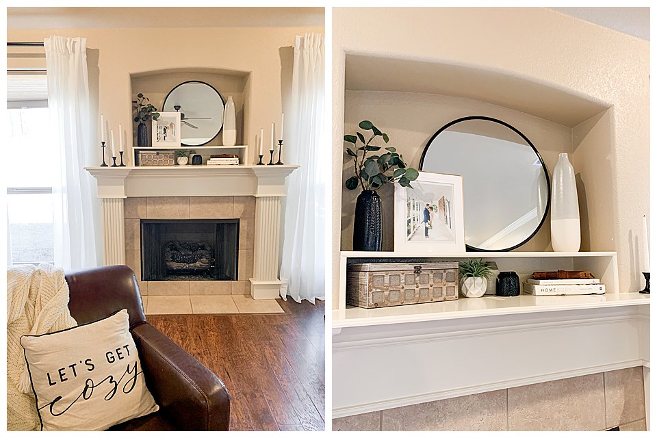
MANTLE DECOR LINKS:
- Hobby Lobby black metal candle sticks
- White unscented taper candles
- Wooden decorative latch box – old find from Hobby Lobby
- Homebody Book
- The Home Edit book
- Tall cream & blue ceramic vase – At Home (No longer available online)
- Gold picture frame – Homegoods find
- Black metal round mirror – TJ Maxx find
- Black ceramic tall & small vase set
- Ikea Eucalyptus stems
LIVING ROOM LINKS:
- Ikea Hilja white curtains
- Ikea Racka black curtain rod combination
- “Let’s Get Cozy” throw pillow – old find from Joann craft store
- Oversized Ikea Jofrid Natural 26×26 pillow cover (w/Ikea feather insert)
- Olive green velvet 20×20 pillow cover
- Swing arm floor lamp from Target
- Multicolor 7’10” x 10′ area rug
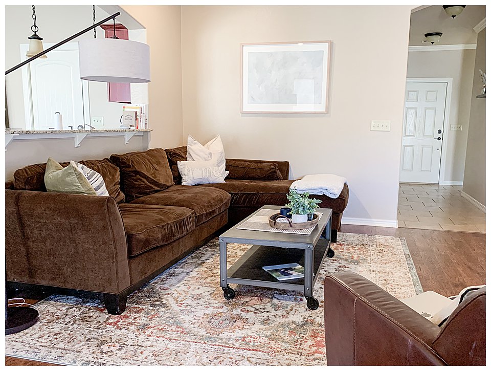
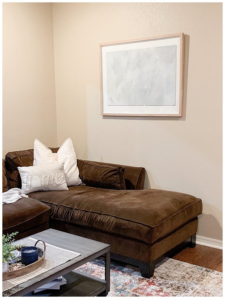
I really wanted to find a large abstract landscape print to hang over our couch. I looked at so many different places online to find one that I loved and could never find the perfect one. I like the idea of an abstract landscape painting, or even a cool framed textured fabric piece, but didn’t find anything I was committed enough to buy. Then we stumbled across this framed art (below) at Kirkland’s store closing and found it for a STEAL! I didn’t like the tie-dye art but figured I could eventually cover it with a painting or textured fabric. After taking it apart, I decided, “why not try my hand at painting something?” I happened to have just two small bottles of paint in my house and a paint brush. I figured if I didn’t end up liking the final product I could always cover it, right? Well we actually ended up liking the outcome and ta-da! Large framed art piece for under $40!

MASTER BEDROOM
Our master has quickly become a place that I love! Pictures don’t adequately show just how cozy it feels in person! For the longest time I have told David, “I just want a grown up room.” As in, I want a real bed (with a headboard, not just metal side rails) actual bedding (not just a duvet insert) and pillows that make it feel complete (not just thrown together). Although our bed arrived much more blue than the photos online appeared (we thought it was more gray) I love how everything has come together and it makes me so happy when I walk into the room!
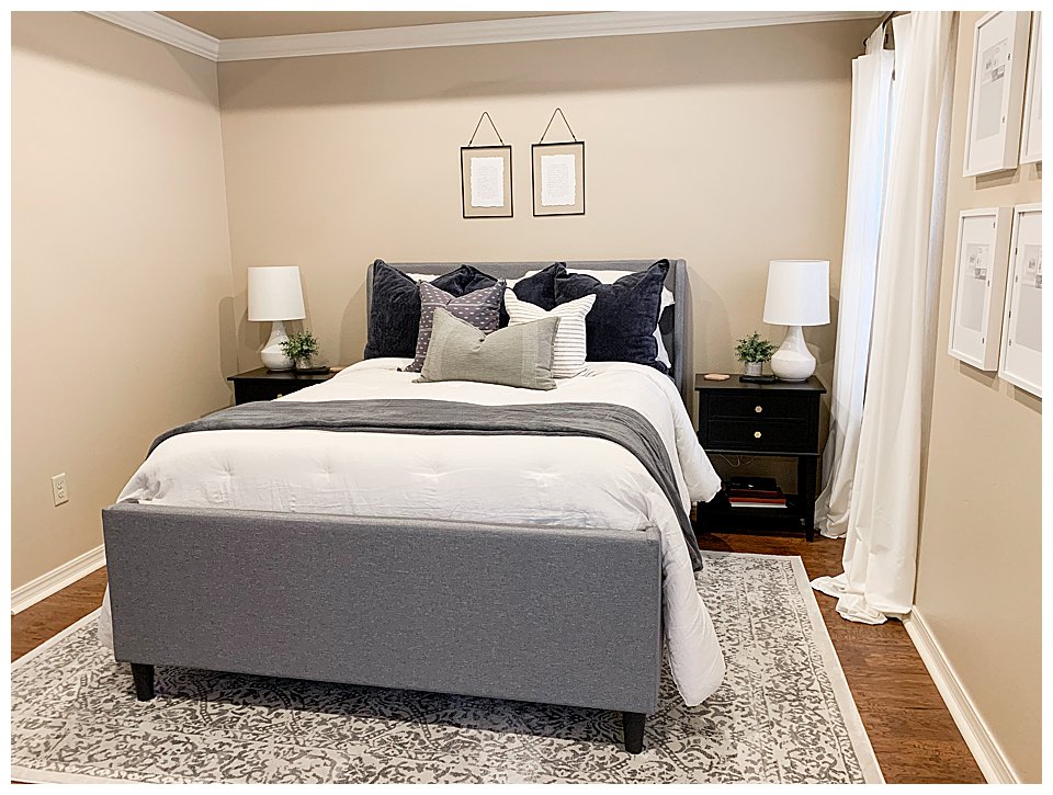
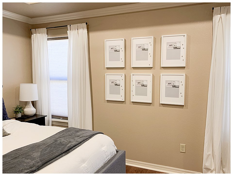
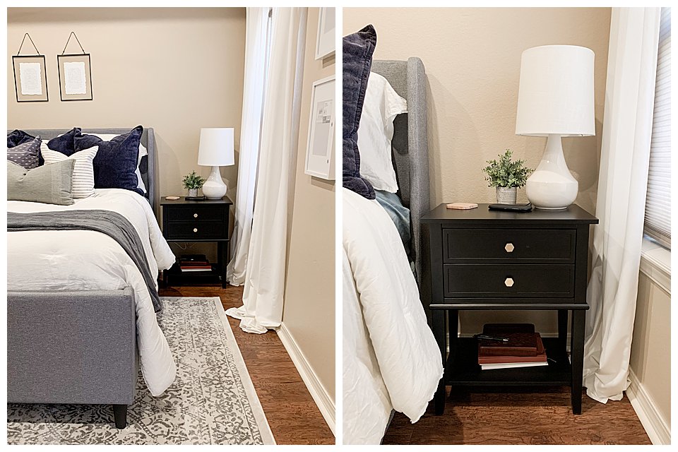
In our apartment, we used our small Ikea dressers as nightstands because we didn’t have space for anything else. When we moved into our house, we knew we needed to get nightstands for both sides of our bed, but had no idea just how expensive such little pieces of furniture would cost! I searched on Facebook Marketplace for the longest time look for anything we could buy or even redo, with no luck. After searching what seems like everywhere online, we finally settles on these black nightstands from Amazon. They are surprisingly great quality, sturdy, and we love the style! The only thing we didn’t love where the silver knobs they originally came with, so just replaced them with gold ones we purchased (also on Amazon) for our dressers.
MASTER BEDROOM LINKS:
- Gray/Ivory area rug
- Gray (more blue) upholstered platform bed
- Ikea Lenda white striped curtains
- Target black curtain rods
- Ikea Ribba 12×16 white gallery frames
- Black two drawer nightstands + gold drawer pulls
- Target white table lamps
- Hearth & Hand comforter set in Sour Cream
- Studio McGee light blue throw pillow
- Studio McGee striped green lumbar pillow
- Threshold black/cream striped throw pillow
- Oversized navy euro pillows (Target, no longer available)
- Hobby Lobby black metal frames (DIY’d vow prints)
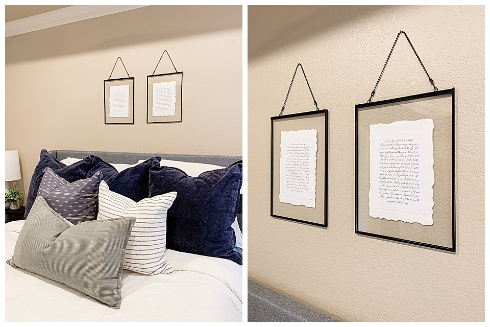
These DIY frames finished off our master perfectly! I loved the frames as soon as I saw them at Hobby Lobby, but didn’t love the original plant print that was in the frames when I purchased them. So I did what any other woman on a mission would do… I DIY’d. I copied our wedding vows and pasted them in a Photoshop document in the font we had our wedding invitations made with, and printed them on our home printer. Then I ripped the edges of the paper to create a softer look, and glued them to the back of the plant print for added texture. I love how they turned out!
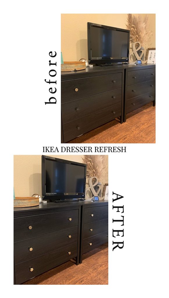
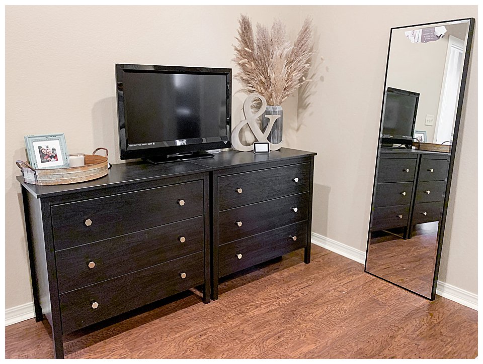
You may remember seeing the before & after Ikea dresser refresh that I shared on Instagram stories a while back. We bought these two black Ikea Hemnes dressers when we first got married to have as nightstands. When we moved into our new home, we decided to push them together to give the illusion of one long dresser, then we changed out the drawer pulls to give it a little refresh! The brushed gold hexagon drawer pulls we found on Amazon were the perfect touch to our cheap little dressers! I’m obsessed with how they look so much more expensive and I really love how they turned out!
I love this functional yet cute space just across from our bed! The pampas grass from All Things Kindred in that black/gray resin vase adds the perfect touch of height and style I wanted to bring into our room. Our large leaning easel mirror was a $60 steal of a deal from Homegoods. The wooden ampersand is from Hobby Lobby and all the other knickknacks are things I already had on hand.
MASTER BEDROOM LINKS:
- Black Ikea Hemnes Dressers
- Brushed gold hexagon drawer pulls
- At Home Black/gray resin vase
- Pampas grass stems from All Things Kindred
- Wooden ampersand – Hobby Lobby
- Black metal floor mirror – Homegoods steal!

Disclaimer: This post includes affiliate links that I would be oh so grateful for you to use if you are interested in purchasing an item you see and love!